Border Gradient in CSS
In this article, I will show you 3 ways to make border gradient in CSS. Without lengthy introduction, we shall get straight to the point.
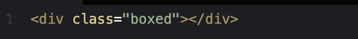
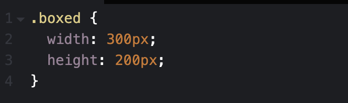
We will have the basic HTML and CSS as follows
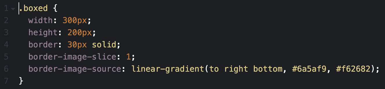
Border-image
In this way, we will use 2 properties in CSS that are border-image-slice and border-image-source, this is the fastest and shortest way but there is a drawback that border-radius isn’t supported with border-image
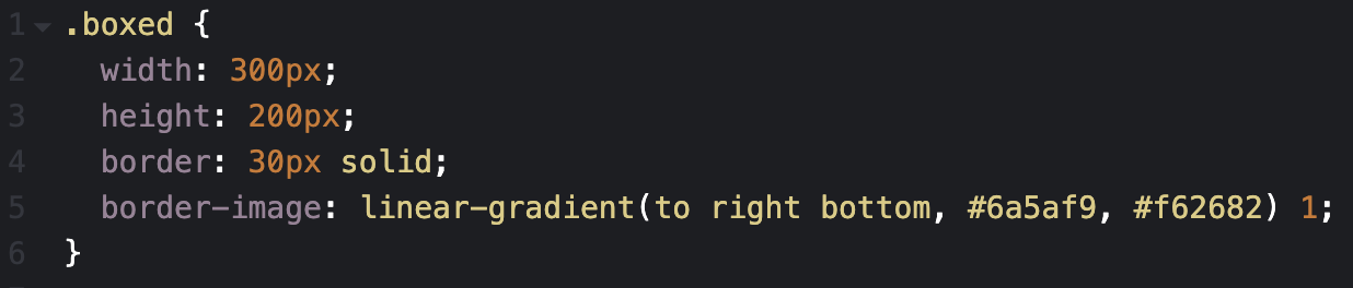
Or in shorthand
And here the result

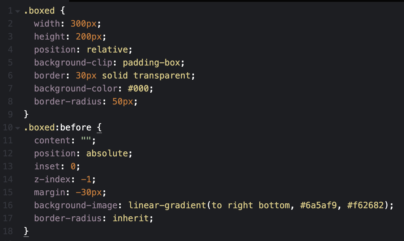
Use before or after (1)
You notice the important properties are background-clip: padding-box and margin: -30px it will correspond to border: 30px . For example border 10px, the margin will be -10px.
and this is the result

Use before or after (2)
Here is a trick that will produce such a result. No complex code, No SVG, or multiple elements are required! only two lines of CSS code using the mask property.
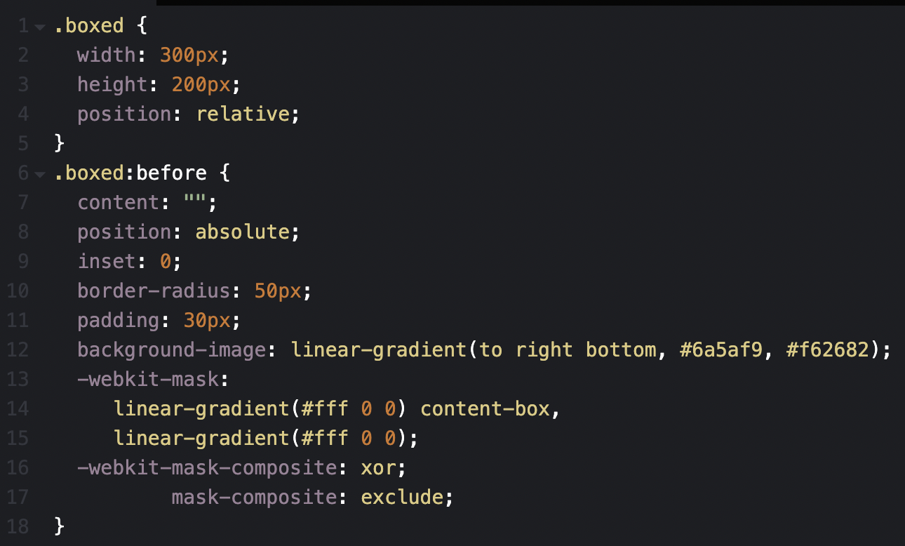
Explanation
/*11/ We set the border width same value as the padding of the pseudo class
/*12/ Set gradient color for element’s border
/*13-15/ Using the mask property, we apply two opaque layers. The bottom one will cover the whole element and the top one will cover only the content box (so it will not cover the border area)
/*17/ We exclude the top layer from the bottom one so that only the border area will be shown!
/*16/ Some browsers still don’t support mask-composite so we use the prefixed version.
We get the same result
Above are 3 ways to create border gradient in CSS that I know, hope it will be useful for you.

